
To start of with my ancillaries I looked at posters and how they could influence my own text of a poster, to carry on my research I’m going to do the same with magazines, and which parts I like, don’t like and how it could potentially influence my own text.
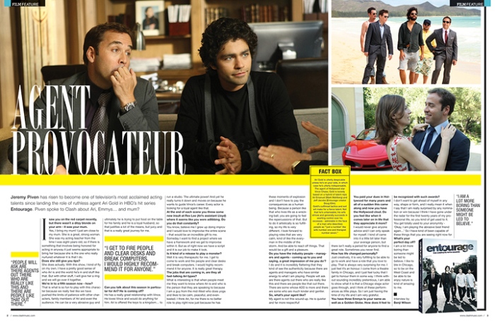
The agent provocateur film review, is interesting in the way it is set out, I like the idea of using three photographs to push what my film is going to be about, one of things that I don’t like is that all of the text is on the bottom half and the photographs are at the top, this divide in the middle creates a look of four boxes with different information, splitting the flow from one page to the next, also as a magazine the split in the middle would cut of the man on the rights face in half completing swallowing him, therefore not working as a real text of a double page spread.
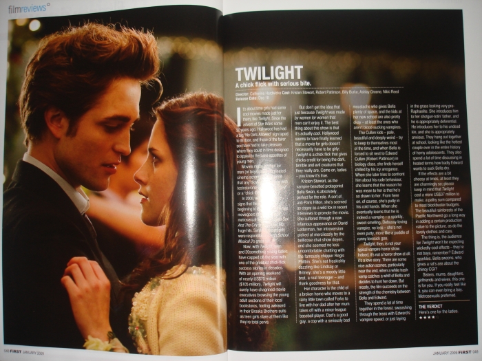
This film review, is a style that I like as I find simplicity to be something of beauty, however there are very few magazine conventions in this film review, this a stylized version with a strong photograph attracting the audiences attention. One of the parts I think could influence my text is having the title attracting the audiences eye towards the film, I also like the colour palette, it creates a vintage feel and adds to the simplicity of the film review.
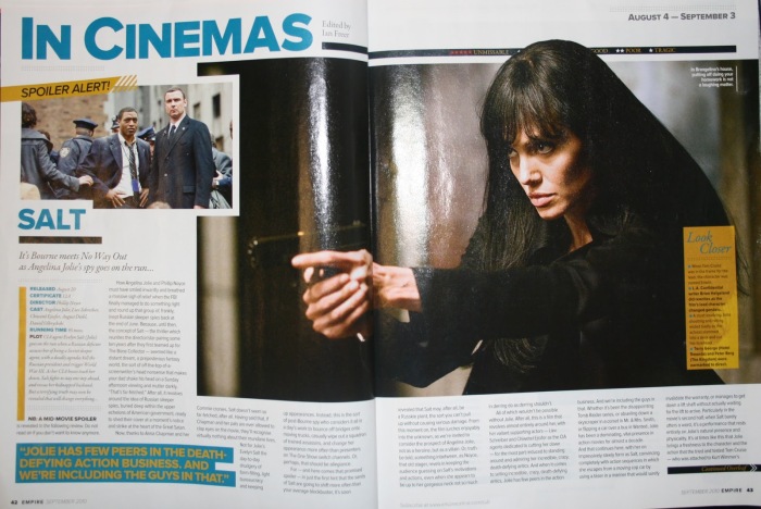
This layout of the magazine I think is the most appropriate for a short film, it has two images with one being bold, it has a bold title that makes the name stick out, ideal for creating synergy with out other products, and the text works well within the double page spread as it doesn’t look like too little or too much it balances well with the images above. The only thing I don’t like about the double page spread is the colour palette of blue and yellow, this may of been the theme for this film however if we were to use this as our style I would prefer to use a pink/purple colour palette to fit within our own theme.
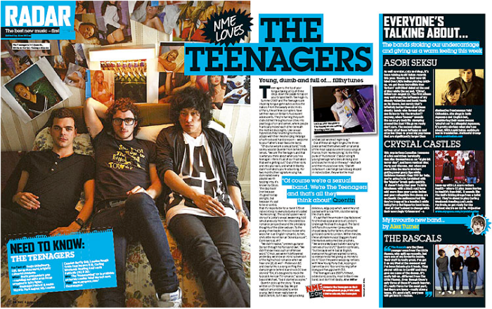
This magazine double page spread is a little more out there the layout and typography is very different, although I like the look of this double page spread I don’t think it holds enough conventions and would fit our theme for Aurora, however this double page spread works extremely well for the film it is promoting it looks like teenagers have created it.
